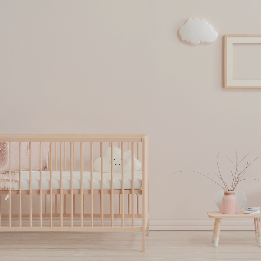
What's Wrong With A Beige Nursery?
The majority of your baby’s visual development will occur from the ages of 0-5. More will happen in this time than in utero, or in their teenage or adult years. Yet, it’s become the accepted norm that nurseries look monochromatic, neutral or pale. That doesn’t seem to fit! Think of it like this. When your baby is learning to eat solids, you expose them to many different foods, textures and flavors. You don’t give them beige, soft goop every day. You want their palette to expand, their curiosity to be peaked, and their chewing muscles to get strong! So you help them get there by giving them carrots, crackers, puffs, and other fun stuff to try and explore!
Think of a baby’s visual development the same way. From day one, your baby is literally “looking” for objects in their surroundings to practice on. There’s a lot to learn and they need a variety of age-appropriate targets to help them along (read more about how newborns see here). A pale or monochromatic nursery is like feeding your baby’s visual system beige, soft goop every day. Don’t give your baby a room full of blah!
Ok, give me an example!
Take our Willow the Whale wall art as an example. We’ve used this piece with all the newborns in our family. A simple, cute whale on the surface, Willow is designed with newborn vision in mind and the curves, patterns, and spacing of the lines create an easily recognizable friend they can actually see! Every baby loves her! My niece has been babbling to Willow like a couple of long-lost buddies catching up over a bottle of milk. My son could care less about most of the developmental toys we bought for him but he always had a soft spot for watching Willow.
A well-designed pattern like Willow single-handedly helps stabilize eye movements, increases attention spans, and provides a target that is perfectly visible to your little one from the day they arrive. It’s not boring, beige, soft goop. It’s a crunchy peanut butter puff, or a sweet, juicy strawberry your baby gets to feast their eyes on. Layers, textures, colors - they matter! Check out the video at the end of this post to see it in action.
Striking a balance in design
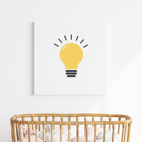
Now we’re not saying you have to paint every corner of your baby’s room with bold, dramatic prints! If you’re looking for a calm, serene ambiance to share with your little one for feeds, naps, and storytime, you both deserve that too! There’s a way to strike a balance between the serene and the dynamic. Create the space you envision, but add pops of visual interest with wall art, linens and accessories with engaging patterns. Your baby will notice and you can feel good about supporting their development in a totally different way.
It’s easy to fall into popular trends when designing your baby’s nursery. But don’t be a beige parent! A mom I know used this term jokingly (specifically "beige mom") to describe parents where everything in their home was beige or grey! Try creating the comforting mood of the nursery of your dreams, but with some pops of visual interest for your baby to enjoy and explore! Even better, let’s make this the newest nursery trend, nurseries babies can see!

Leave a comment
This site is protected by hCaptcha and the hCaptcha Privacy Policy and Terms of Service apply.